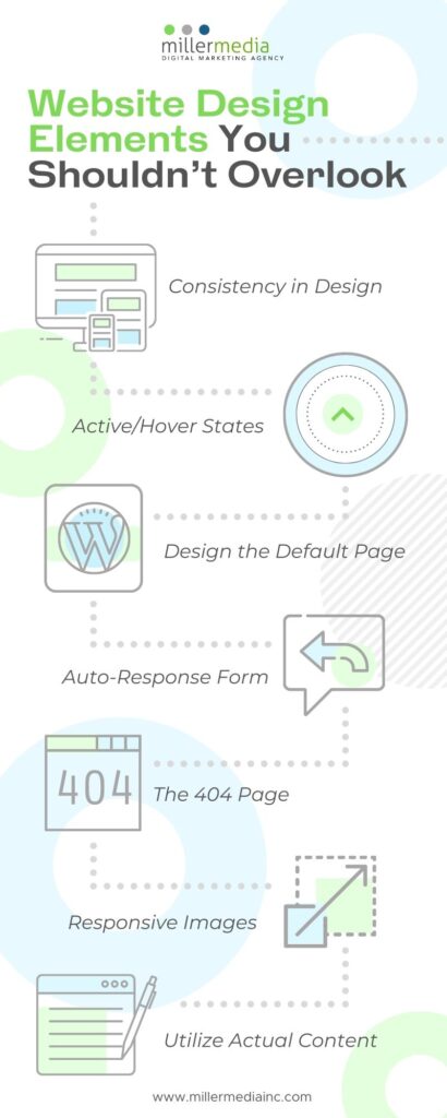
Certain important elements can be missed when developing a website for your business. Whether you are planning to create a totally new website or re-designing your old one, here are items to consider that you may miss:

- Consistency in Design
Color, typefaces, font sizes, image arrangement and more need to feel like they belong to the same brand. If possible, have a brand or style guide on hand that you can give to the designer and developer. You want to make sure your potential clients know you are professional and that their computer didn’t send them to a different company’s website.
2. Active/Hover States
The active/hover states of buttons and navigation are a forgotten element that can create an interesting dynamic feel to the user experience. Having a vibrant secondary color or graphic can draw attention to the user’s cursor and the increase the chance they will click on the button. This can be tool that can help lead to higher conversion rates.
3. Design the Default Page
If you’re using a CMS such as WordPress, the default page acts as a layout page for the rest of the site. This is important later down the line if your business grows to develops new products or services and there needs to be a new page added to your website. The elements of the default page such as the nav and footer are consistent with your existing website, you don’t have design a new page from scratch.
4. Auto-Response Form
Contact forms, subscribe boxes, and any other forms on your website should have a conformation response when the user clicks “submit” or “send”. If your business is closed on a certain day, editing the forms’ automated response is a good way to inform you client when that will get a response. For example, you are a bakery that is closed on Sunday, but a service request was submitted Saturday before closing, your message could say “Thank for contacting us! We look forward to contacting you on our next business day. Check out hours to see when we are open!”
5. The 404 Page
Often the focus is to make the website work perfectly. While it is important that it functions well as often as possible there is going to updates to page or URLs that are going to pop up occasionally. The 404 page is actually important to branding and indicating to the user that the link is no longer around or will back shortly. A well designed 404 page comes off as more professional than the generic default text pops up.
6. Responsive Images
The resolution of your images differs for each screen size. A rule of thumb for responsive websites is to double the largest resolution for your web ready photos. For example, 72dpi is the default for desktop images. Double it to 150dpi so when you switch to mobile your image does not lose the clear quality it had on desktop.
7. Utilize Actual Content
Lorem Ipsum is placeholder text designers often use if the business does not have content during the web building process. However, you want actual information about your company and its product or service available before launching. Ideally, start off with a site map and layout design and have the content ready before development, so if the quantity of content effects the layout the designer can make adjustments before moving on to function of the website.
Missing any of these elements? Call 248.528.3600

