

Home » WEB DESIGN » Mobile Responsive Web Design
Mobile Responsive Web Design
Adapt, Respond, and Overcome
- Does your website strategy include Responsive Web Design (RWD)?
- Does your website pass Google's Mobile Friendly Test?
- How is your mobile website's speed and performance? (test with Google's Test My Site tool)
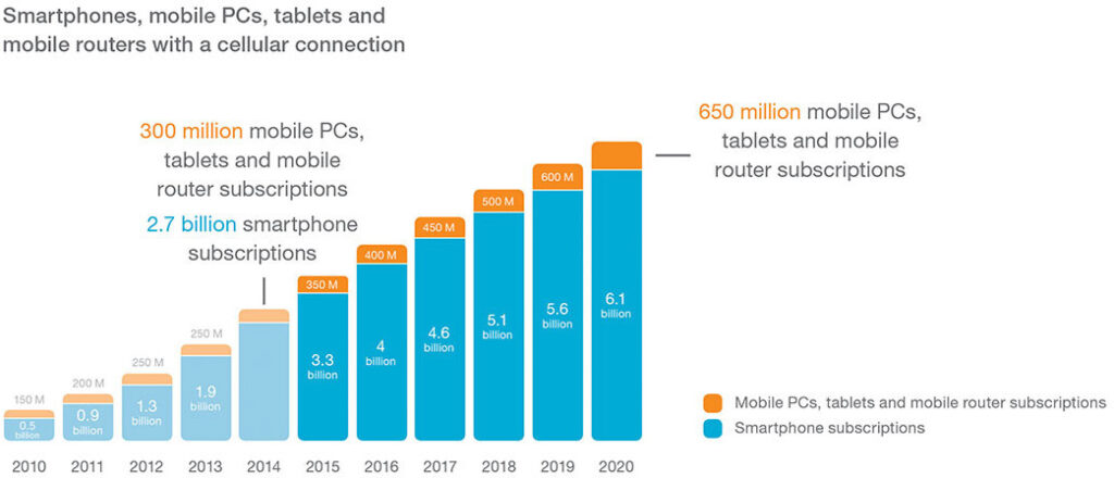
Smartphones are everywhere now; in the next decade, 90 percent of the world’s population over the age of six will have a mobile phone. In total, by 2020, there will be at least 6.1 billion smartphones globally.
Responsive web design responds to the needs of the users and the handheld devices they’re using. The layout changes based on the size and capabilities of that specific device. For example, on a cellphone, users would see content shown in a single column view; a tablet might show the same content in two columns.
Benefits of Having a Mobile / Responsive Website
- Website is more search engine friendly
- Website will be optimized for all "smart" devices
- User friendliness
- Working towards "One Web"
Day by day, the number of devices, platforms, and browsers that need to work with your site grows. Responsive web design represents a fundamental shift in how we'll build websites for the decade to come.
- Jeffrey Veen