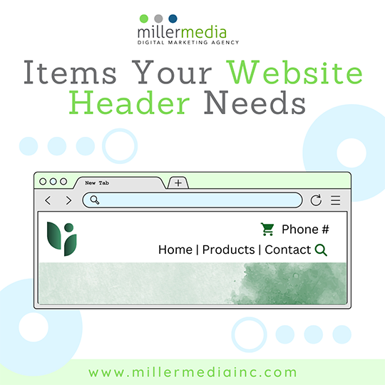
It may seem easy to design the top of your website. If fact most CMS like WordPress have templates that have a basic top ready to use, but you may forget some elements if you are busy with more important content. Here is a list of necessary items that the header of your website must have to be functional:
Logo
Your company logo is needed so that visitors know that it is your company website that they are on. Make sure your logo is visible at a small size and that the colors are in RGB (digital colors). If you have an old logo, it may be time for a re-design by a professional design agency. If you have an illustrative one or one with a lot of detail, you may need to simplify or have your logo visible embedded in your top image. Be aware that if you have it embedded in your top image it could mean for future images your logo must be visible or you will have to forgo sliders or videos where the logo isn’t there. Logos in the header are often hyperlinked to take the user back to the home page.
Navigation Menu
Whether you have individual links to each page, a mega menu, or a hamburger menu, you need to have a way for users to navigate your website. Usually access to a navigation menu is at the top. There are some exceptions to the rule like side menus, but those are usually reserved for apps where users will swipe to access the navigation. Before designing your website, it is ideal to have a sitemap where you can figure out how many pages you need and how they will be maneuvered. This will inform what type of navigation to use.
Call To Action
You want to encourage users to take the next step in the sale process. CTAs that are usually at the top-right of your webpage are:
- Company phone number
- Email Us Icon/Link
- Contact Us Page
- Request a Quote Page
- Support Link
Search Bar
A search bar is needed if you have a large website with a lot of products, services, or information. Distributor websites will have a search bar at the top of their website so users can type in the brand they want, and it will directly pop up. The users will not have to go into layers of webpages to hunt down what they want. This will prevent clients from giving up on your website and bouncing out. A simple search bar can improve click-through-rates and improve the user experience of your website.
Ecommerce Icons
If your business is ecommerce, then you need icons your user can use to complete the purchase and continue for future purchases. These icons are:
- Login/My Account icon
- Add to Cart icon
- Add to Wish List icon
- A Like/Favorite icon
- A Share icon
Need help fixing your web design? Call 248.528.3600.

